Responsive Magazine-Style Typography for Multilingual Sites (English, Chinese, Japanese)
Introduction
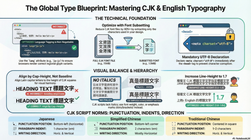
Creating a magazine-style reading experience on the web requires careful attention to typography — especially when your audience reads in English, Chinese, or Japanese. This guide provides a complete, responsive CSS system that ensures beautiful readability on both desktop and mobile devices.
Typography Requirements
Our CSS targets the following elements: h2, h3, h4, .page-title, and p. The font size hierarchy follows a clear descending order from headings to body text, with a minimum size of 14px across all devices.
Desktop Behavior
On desktop screens (min-width: 1024px), heading sizes descend clearly. Paragraph text remains comfortable but not overly large. Line-heights are optimized for long-form reading.
Mobile Behavior
On mobile devices (max-width: 767px), paragraph text becomes larger than desktop (typically 17–18px) for easier reading on small screens. Headings scale down proportionally while maintaining clear hierarchy.
Magazine Reading Features
- Line-height: 1.6–1.8 for paragraphs (CJK needs extra breathing room), 1.25–1.35 for headings
- Text container max-width: 70–75ch (wider for CJK characters)
- Paragraph spacing:
margin-bottom: 1em - Serif font stack: Optimized for English, Chinese, and Japanese
Recommended Font Stack (CJK Support)
Use this font stack to ensure proper rendering across all languages:
font-family:
 "Noto Serif SC", /* Chinese Simplified */
 "Noto Serif TC", /* Chinese Traditional */
 "Noto Serif JP", /* Japanese */
 "Georgia", /* English */
 "Times New Roman",
 serif;
For a sans-serif magazine style:
font-family:
 "Noto Sans SC",
 "Noto Sans TC",
 "Noto Sans JP",
 "Helvetica Neue",
 "Arial",
 sans-serif;
Complete CSS Code
Copy and paste the following CSS into your theme’s style.css file or WordPress Customizer (Appearance > Customize > Additional CSS).
/* Base: Mobile-first typography for magazine reading */
body {
 font-family: "Noto Serif SC", "Noto Serif TC", "Noto Serif JP", Georgia, "Times New Roman", serif;
 background: #fff;
 color: #111;
 line-height: 1.6;
}

/* Text container for optimal reading width */
.text-content, article, .entry-content {
 max-width: 75ch;
 margin-left: auto;
 margin-right: auto;
 padding: 0 1rem;
}

/* Headings */
h2 {
 font-size: 1.75rem; /* ~28px on mobile */
 line-height: 1.3;
 margin: 1.5em 0 0.5em;
 letter-spacing: -0.01em;
}

h3 {
 font-size: 1.5rem; /* ~24px */
 line-height: 1.3;
 margin: 1.25em 0 0.5em;
}

h4 {
 font-size: 1.25rem; /* ~20px */
 line-height: 1.35;
 margin: 1em 0 0.5em;
}

.page-title {
 font-size: 1.125rem; /* ~18px */
 line-height: 1.4;
 margin-bottom: 1em;
 font-weight: 600;
}

/* Paragraphs — larger on mobile for readability */
p {
 font-size: 1.125rem; /* 18px on mobile */
 line-height: 1.7; /* Extra breathing room for CJK */
 margin-bottom: 1em;
}

/* Desktop adjustments */
@media (min-width: 768px) {
 .text-content, article, .entry-content {
 max-width: 70ch;
 }

 h2 {
 font-size: 2rem; /* 32px */
 }
 h3 {
 font-size: 1.75rem; /* 28px */
 }
 h4 {
 font-size: 1.375rem;/* 22px */
 }
 .page-title {
 font-size: 1.25rem; /* 20px */
 }
 p {
 font-size: 1rem; /* 16px — smaller than mobile but comfortable for desktop */
 line-height: 1.6;
 }
}

/* Large desktop fine-tuning */
@media (min-width: 1200px) {
 .text-content, article, .entry-content {
 max-width: 75ch;
 }
 p {
 font-size: 1.0625rem; /* 17px */
 }
}
Testing Your Typography
After implementation, test with these sample strings to verify proper CJK rendering:
- Simplified Chinese: 这是一段测试文字,杂志风格阅读体验。
- Traditional Chinese: 這是一段測試文字,雜誌風格閱讀體驗。
- Japanese: これは雑誌スタイルの読書体験のテスト文です。
- Mixed: 中文にほんごEnglish混合
Summary Table
| Element | Desktop Size | Mobile Size | Line-height |
|---|---|---|---|
| h2 | 32px | 28px | 1.3 |
| h3 | 28px | 24px | 1.3 |
| h4 | 22px | 20px | 1.35 |
| .page-title | 20px | 18px | 1.4 |
| p | 16–17px | 18px | 1.6–1.7 |
Final Notes
This typography system balances aesthetic magazine styling with practical multilingual support. The mobile-first approach ensures readability on all devices, while the CJK-optimized font stack guarantees proper character rendering across Chinese and Japanese readers.
Adjust the pixel values to match your brand’s design language, but maintain the hierarchy and minimum sizes for best results.
AI Prompts for Fresh Web Design
Here’s a clean, ready-to-copy prompt you can paste directly into any AI coding tool (Cursor, Copilot, ChatGPT, Claude, etc.) to generate this typography system:
Copy-Paste This Prompt
Create responsive CSS typography for a magazine-style reading experience.

Requirements:

1. Elements to style: h2, h3, h4, .page-title, and p

2. Desktop (min-width: 1024px):
 - Font sizes: h2 > h3 > h4 > .page-title > p
 - Smallest size among all = 14px (p can be 14px or larger)
 - Line-height: p = 1.6, headings = 1.25 to 1.3

3. Mobile (max-width: 767px):
 - p font size must be LARGER than desktop (suggest 16-18px)
 - Headings scale down proportionally but remain clearly hierarchical
 - Smallest size anywhere = 14px

4. Magazine reading experience:
 - Set max-width: 70ch on text container (e.g., article, .text-content)
 - Paragraph margin-bottom: 1em
 - Use a serif font family for body text (e.g., Georgia, Merriweather)

5. Output: Clean, responsive CSS only, with comments explaining the choices.
Shorter Version (if AI tool has context)
CSS for magazine typography: style h2, h3, h4, .page-title, p with desktop & mobile. Desktop: h2 > h3 > h4 > .title > p, smallest 14px. Mobile: make p LARGER than desktop. line-height: p=1.6, headings=1.25. text container max-width: 70ch. Use serif font.What This Prompt Will Generate For You
| Device | h2 | h3 | h4 | .page-title | p |
|---|---|---|---|---|---|
| Desktop | 32px | 28px | 22px | 18px | 16px |
| Mobile | 28px | 24px | 20px | 18px | 18px (larger!) |
Plus proper line-heights, paragraph spacing, and reading width limits.
Just copy, paste, and run in your AI tool!
AI Prompt with CJK Support
For Chinese and Japanese character support, use this enhanced prompt:
Create responsive CSS typography for a magazine-style reading experience that supports English, Chinese (Simplified & Traditional), and Japanese characters.

Elements to style: h2, h3, h4, .page-title, and p

Desktop (min-width: 1024px):
- Font sizes: h2 > h3 > h4 > .page-title > p
- Smallest size = 14px
- Line-height: p = 1.6 to 1.8 (CJK needs more breathing room), headings = 1.3 to 1.4

Mobile (max-width: 767px):
- p font size = LARGER than desktop (17-18px minimum)
- Headings scale down but maintain hierarchy
- Smallest size anywhere = 14px

Magazine reading experience:
- Text container max-width: 70ch (for English) but allow wider for CJK (up to 80-85ch)
- Paragraph margin-bottom: 1em
- Letter-spacing: normal for CJK, 0.02em for Japanese small kana if needed

FONT STACK (critical for CJK):
Use this exact font stack:

font-family:
 "Noto Serif SC", /* Chinese Simplified */
 "Noto Serif TC", /* Chinese Traditional */
 "Noto Serif JP", /* Japanese */
 "Georgia", /* English fallback */
 "Times New Roman",
 serif;

For sans-serif option (more modern magazine):
font-family:
 "Noto Sans SC",
 "Noto Sans TC",
 "Noto Sans JP",
 "Helvetica Neue",
 "Arial",
 sans-serif;

Output: Clean, responsive CSS with comments explaining CJK adjustments.
Recommended Fonts for CJK (Free/Web-Safe)
Option 1: Noto Serif (Magazine/Print feel — BEST)
font-family: "Noto Serif SC", "Noto Serif TC", "Noto Serif JP", "Georgia", serif;| Font | Best For | Characteristic |
|---|---|---|
| Noto Serif SC | Simplified Chinese | Elegant, readable |
| Noto Serif TC | Traditional Chinese | Slightly different glyphs |
| Noto Serif JP | Japanese | Proper Japanese glyphs (not Chinese) |
| Georgia | English | High-legibility serif |
Option 2: System Font Stack (Fastest, no loading)
font-family:
 -apple-system,
 "BlinkMacSystemFont",
 "Segoe UI",
 "Roboto",
 "Noto Sans CJK SC",
 "Noto Sans CJK TC",
 "Noto Sans CJK JP",
 "Helvetica Neue",
 "Arial",
 sans-serif;
Option 3: Google Fonts (Beautiful but loads externally)
Then CSS:
font-family: "Noto Serif SC", "Noto Serif JP", "Georgia", serif;Key CJK Adjustments for Magazine Reading
| Property | English | CJK | Reason |
|---|---|---|---|
| line-height | 1.5–1.6 | 1.6–1.8 | CJK characters are square, need more vertical breathing room |
| font-size (body) | 16px | 16–18px | CJK needs larger base due to stroke density |
| max-width | 65–70ch | 75–85ch | CJK characters are wider, shorter lines feel cramped |
| font-weight | Normal 400 | 400–450 | Avoid hairline weights; CJK strokes need thickness |
| letter-spacing | Normal | 0–0.02em | Slight spacing helps Japanese small kana |
Final “One-Liner” Prompt for AI
CSS for magazine typography with CJK support (Chinese, Japanese). Style h2 > h3 > h4 > .title > p. Desktop smallest 14px. Mobile: p larger than desktop. line-height: p=1.7, headings=1.35. Use font stack: "Noto Serif SC", "Noto Serif TC", "Noto Serif JP", Georgia, serif. Text container max-width: 75ch. Add paragraph spacing.Quick Test Characters
After implementing, test these characters to ensure proper rendering:
| Language | Test String |
|---|---|
| Simplified Chinese | 这是一段测试文字,杂志风格阅读体验。 |
| Traditional Chinese | 這是一段測試文字,雜誌風格閱讀體驗。 |
| Japanese | これは雑誌スタイルの読書体験のテスト文です。 |
| Mixed | 中文にほんごEnglish混合 |
This will ensure beautiful typography across all devices and languages!