Logo显示优化:让您的品牌更清晰
—
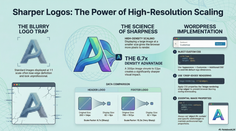
The Problem
Logos often look blurry or pixelated when displayed at full size. The browser stretches or compresses the image, resulting in poor quality.
—
Our Logo Analysis
Header Logo: 350×54px (6.48:1 aspect ratio)
Footer Logo: 795×157px (5.06:1 aspect ratio)
—
The Solution
Display high-resolution images at smaller sizes. This gives the browser more pixels to work with, resulting in crisp edges, clear details, and professional appearance.
Example: A 350×54px image displayed at 52×8px gives each screen pixel 6.7 image pixels, making it much sharper.
—
Size Comparison
Header Logo Options
| Display Size | Scale Factor | Sharpness | Use Case |
|---|---|---|---|
| 35×6px | 10x | Very Sharp | Minimal design |
| 52×8px | 6.7x | Sharp | Recommended |
| 70×11px | 5x | Sharp | Larger display |
Footer Logo Options
| Display Size | Scale Factor | Sharpness | Use Case |
|---|---|---|---|
| 35×7px | 22.7x | Very Sharp | Minimal design |
| 52×10px | 15.3x | Very Sharp | Recommended |
| 70×14px | 11.4x | Sharp | Larger display |
—
CSS Implementation
CSS Properties Reference
| Property | Value | Purpose |
|---|---|---|
| `width` | 52px | Set display width |
| `height` | 8px/10px | Set display height |
| `max-width` | 52px | Prevent scaling up |
| `max-height` | 8px/10px | Prevent scaling up |
| `object-fit` | contain | Maintain aspect ratio |
| `image-rendering` | crisp-edges | Sharp edges |
| `image-rendering` | -webkit-optimize-contrast | Chrome optimization |
| `-webkit-font-smoothing` | antialiased | Smooth text |
| `-moz-osx-font-smoothing` | grayscale | Firefox optimization |
Header Logo CSS
/* Header Logo - 52x8px Display */
#header-logo-image img,
.custom-logo {
    width: 52px !important;
    height: 8px !important;
    max-width: 52px !important;
    max-height: 8px !important;
    object-fit: contain;
    image-rendering: -webkit-optimize-contrast;
    image-rendering: crisp-edges;
    -webkit-font-smoothing: antialiased;
    -moz-osx-font-smoothing: grayscale;
}
Footer Logo CSS
/* Footer Logo - 52x10px Display */
.tg-first-footer-widget .textwidget img,
#colophon .textwidget img,
.footer-widgets-area .textwidget img {
    width: 52px !important;
    height: 10px !important;
    max-width: 52px !important;
    max-height: 10px !important;
    object-fit: contain;
    image-rendering: -webkit-optimize-contrast;
    image-rendering: crisp-edges;
    -webkit-font-smoothing: antialiased;
    -moz-osx-font-smoothing: grayscale;
}
—
How to Add CSS
- Log in to WordPress Admin
- Go to **Appearance** → **Customize**
- Click **Additional CSS**
- Paste the CSS code
- Click **Publish**
—
Summary
| Logo | Original Size | Display Size | Scale Factor | Sharpness |
|---|---|---|---|---|
| Header | 350×54px | 52×8px | 6.7x | Sharp |
| Footer | 795×157px | 52×10px | 15.3x | Very Sharp |
—
Conclusion
By displaying high-resolution logos at smaller sizes, you achieve maximum sharpness, professional appearance, and better user experience. This simple CSS optimization makes a significant difference in how your logo appears on your website.
—
*Published: 2026-03-26*
*Category: Tutorials*
*Tags: Best Practices, How-To, Image Optimization*