WordPress图片优化:高分辨率源图+小尺寸显示技术
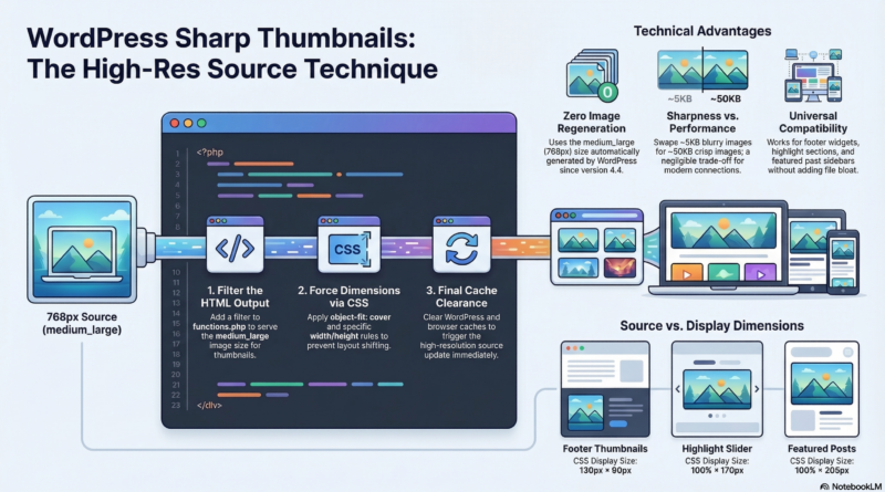
The Concept
Here’s a smart WordPress image optimization technique used by many professional sites: serving high-resolution source images while forcing smaller display dimensions via CSS.
How it works:
Stored file size → Display size
130×90.png → displayed at 130×90 (served directly)
OR
768×0.jpg → displayed at 130×90 (CSS scales it) ← This technique
Required Code Changes
1. Functions.php – Serve High-Res Sources
Add this code to your theme’s functions.php file:
function force_widget_higher_quality_display($html, $post_id, $post_image_id, $size, $attr) {
    // Only affect widget thumbnails on frontpage
    if (!is_front_page() && !is_home()) {
        return $html;
    }

    $widget_sizes = array(
        'highlighted-post',
        'featured-post-medium',
        'featured-post-small',
        'default-news'
    );

    if (in_array($size, $widget_sizes)) {
        // Use 'medium_large' (768px) instead of small sizes
        $better_src = wp_get_attachment_image_src($post_image_id, 'medium_large');

        if ($better_src) {
            // Replace src but keep original dimensions displayed
            $html = preg_replace('/ src="[^"]+"/', ' src="' . esc_url($better_src[0]) . '"', $html);
        }
    }

    return $html;
}
add_filter('post_thumbnail_html', 'force_widget_higher_quality_display', 10, 5);
2. CSS – Force Correct Display Dimensions
Add this CSS code (via Appearance > Customize > Additional CSS or your theme’s stylesheet):
/* Footer/thumbnails force 130x90 */
.front-page .following-post .featured-post-small img,
.home .following-post .featured-post-small img,
.front-page .breaking-news-widget-inner_wrap .featured-post-small img,
.home .breaking-news-widget-inner_wrap .featured-post-small img {
    width: 130px !important;
    height: 90px !important;
    object-fit: cover;
}

/* Highlights section force 170px */
.front-page .highlights-featured-image img,
.home .highlights-featured-image img {
    width: 100% !important;
    height: 170px !important;
    object-fit: cover;
}

/* Featured posts force 205px */
.front-page .widget_featured_posts .featured-post-medium img,
.home .widget_featured_posts .featured-post-medium img {
    width: 100% !important;
    height: 205px !important;
    object-fit: cover;
}
3. Do I Need to Regenerate Images?
No regeneration required! 🎉
This technique is special because:
- WordPress automatically generates
medium_large(768px) images for EVERY upload - These images already exist in your media library
- The code simply points to the existing
medium_largeversion - No additional file generation needed
When would you need regeneration?
- Only if you changed your
add_image_size()configuration infunctions.php - Or if you want to ensure all thumbnails use the correct sizes for consistency
Why This Works
WordPress automatically generates several image sizes for every upload:
| Size | Dimensions | Purpose |
|---|---|---|
thumbnail |
150×150 | Small thumbnails |
medium |
300×300 | Medium displays |
medium_large |
768×0 | ← Our target size |
large |
1024×1024 | Large displays |
full |
Original | Source file |
What medium_large (768×0) means:
- Width: 768px (fixed)
- Height: 0 = auto (maintains aspect ratio)
- Generated automatically by WordPress – no extra setup needed
- Introduced in WordPress 4.4 specifically for responsive images
Benefits
| Benefit | Explanation |
|---|---|
| ✅ High quality | 768px source = much sharper than scaling up from 130px |
| ✅ Small display | CSS keeps layout consistent (130×90, 170px, 205px, etc.) |
| ✅ Future-proof | New images automatically benefit |
| ✅ No file bloat | Uses existing medium_large size – no extra generation |
| ✅ Simple | Minimal code, automatic operation |
| ✅ No regeneration needed | Uses images that already exist |
Display Dimensions Used
| Section | Width | Height | Purpose |
|---|---|---|---|
| Footer thumbnails | 130px | 90px | Small featured post thumbnails |
| Highlights section | 100% | 170px | Top slider featured images |
| Featured posts | 100% | 205px | Right sidebar post previews |
| Default news | 100% | 205px | News ticker thumbnails |
File Size Considerations
| Size | File Size |
|---|---|
| 130×90 thumbnail | ~2-5 KB |
| 768×0 medium_large | ~50-100 KB |
The size trade-off is negligible:
- Only 4-6 thumbnails per page
- Modern connections handle 100KB easily
- Quality improvement is worth it
When to Use This
Use this technique when:
- Image quality matters more than file size savings
- You have fast CDN/hosting
- Want sharp, crisp thumbnails
- Maintaining consistent visual quality is priority
- Quick implementation without regeneration
Don’t use when:
- Bandwidth is extremely limited
- Serving to very old devices
- File size is critical (mobile-first, data-constrained users)
Final Setup Checklist
- ✅ Add code to
functions.php - ✅ Add CSS rules via Customizer or stylesheet
- ✅ No image regeneration needed (uses existing
medium_largeimages) - ✅ Clear WordPress cache: Settings > Clear cache or use cache plugin
- ✅ Clear browser cache: Ctrl+Shift+R (Windows/Linux) or Cmd+Shift+R (Mac)
This optimization provides sharp, consistent image quality across all sections while keeping layout dimensions perfect. The medium_large images already exist and will be served immediately after adding the code and clearing caches.